Formatting of How-to Cards using Markdown#
All How-to Card sources are formatted using Markdown – a lightweight markup language with plain text syntax. Markdown is very easy to learn, supports a wide variety of ways in which we want to format text, has great support in editors, and is quite popular as a base document syntax in almost all fields of computing.
The main features are as follows:
- The syntax is quite easy to learn.
- It is already widely used in computing and general scientific community.
- It separates content from visual presentation so it allows you to focus on writing, not formatting.
- It is not a proprietary file format.
- It is portable - since it is plain text, it can be opened by literally any text editor.
- It is very interoperable - as simple text, markdown documents can be tracked and versioned (e.g. using Git or SVN), and easily converted to many other formats for viewing (e.g. using Pandoc)
- It does not store any bloat, leading to very small files (in a stark contrast to e.g. Word)
Below we show various formatted text together with the markdown code that produces that formatting.
It is also recommended to follow the Markdown guide and various other online resources for more examples.
All cards also contain a YAML metadata header separated by triple hyphen
(---), as specified by Pandoc extension
yaml_metadata_block.
The header is used to specify various processing- and categorization-related
information that do not render directly in the card text, but typically have
effect on how the card displays to the users in lists, URLs, and references.
Header metadata are documented separately.
Basic formatting#
You can write emphasized or highlighted text as follows:
You can write *emphasized* or **highlighted** text.

You can write _emphasized_ or __highlighted__ text.     <- same result, looks more like underscore
You can break lines anywhere. Only if you leave an empty line, that means the text is going to appear in another paragraph.
This is demonstrated below:
You can break
lines anywhere.
Only if you leave an empty line,
that means the text is going to
appear in another paragraph.

This is demonstrated below:
Headings and sections#
You can make headings by prefixing a line with sharps (#). Each added sharp adds one “nesting level” to the headings, making it “smaller”. This allows you to organize the text into subsections of varying granularity.
# Heading level 1

## Heading level 2

### Heading level 3

#### Heading level 4

##### Heading level 5

###### Heading level 6
Unordered lists#
Unordered lists have no numbering, such as this one:
- unordered list
- of things
- some of these can be nested by prefixing the list mark by a few spaces:
  - apples
  - bananas
- and not nested again
In markdown, it is formatted as follows:
- unordered list
- of things
- some of these can be nested by prefixing the list mark by a few spaces:
- apples
- bananas
- and not nested again(Note you can also use asterisks * and pluses + as the list “tick” mark.)
Ordered lists#
Ordered lists are numbered:
- ordered list
- of well-ordered
- items of various order
In markdown, you simply write the numbers with a dot:
1. ordered list
2. of well-ordered
3. items of various order
(Note there is no need to actually number the list – you can write 1.
everywhere and the list is going to be numbered correctly.)
Description lists#
Description lists are used for lists of “topics” or ideas; typically very useful if you want to avoid lots of “small sections”. This is great for term definitions, elaborated rulesets, and generally for lists where all items have assigned names.
- Something
- Description of Something. Something is interesting.
- Something else
- A more complicated description of Something else. This is also interesting.
In markdown, the above list is formatted as follows:
Something
: Description of Something. Something is interesting.

Something else
: A more complicated description of Something else. This is also interestingLinks#
You can include links to web pages, to other how-to cards, and to e-mails, such as lcsb-r3@uni.lu.
In markdown, the above links are formatted as follows:
You can include links to [web pages](https://www.uni.lu/), to [other how-to
cards](/general/links), and to e-mails such as <lcsb-r3@uni.lu>.
Linking to individual sections#
You can make a link to a part of the given card, such as to a section about picture sizes below.
In markdown, you simply write down a link with an address that starts with a
sharp (#) and continues with a hyphenated name of the given section:
You can make a link to a part of the given card, such as to
[a section about picture sizes below](#sizing-of-pictures).
If you want to make sure the identifier of the section is short and stable, you
can use the extended header syntax to add a specific “name” to the section: You
add the name with a # into a curly braces after the heading, and then you
link to that section using the name:
## Example heading that talks about pictures {#section-about-pictures}

...

More information is available [here](#section-about-pictures).
Computer code#
You can write computer_code using backticks. Larger code blocks can be
separated using triple backticks.
The sentence is formatted as follows:
You can write `computer_code` using backticks. Larger code blocks can be
separated using triple backticks.Tables#
You can make tables, like this one:
| Item | Price | # In stock |
|---|---|---|
| Juicy Apples | 1.99 | 739 |
| Bananas | 1.89 | 6 |
The code to produce the above table is:
| Item         | Price | # In stock |
|--------------|:-----:|-----------:|
| Juicy Apples |  1.99 |        739 |
| Bananas      |  1.89 |          6 |
You do not need to align the columns perfectly in the plain text with spaces; the formatting shown below is also OK (even preferred in many cases):
| Item | Price | # In stock |
|---|:---:|---:|
| Juicy Apples | 1.99 | 739 |
| Bananas | 1.89 | 6 |
The actual column alignment (left, right and center) is determined from the
colons (:) in the header separator line. As a mnemonic to remember the
alignment syntax, you can imagine the colon sign as an “arrow head”, i.e.,
--: is like -->, which means “align to right”.
Quotations#
Sometimes it is nice to visually separate a cited quotation:
The University of Luxembourg (French: Université du Luxembourg; German: Universität Luxemburg; Luxembourgish: Universitéit Lëtzebuerg) is a public research university in Luxembourg. – Wikipedia
The quotations are formatted by prefixing all lines with a >, as follows:
> The University of Luxembourg (French: Université du Luxembourg; German:
> Universität Luxemburg; Luxembourgish: Universitéit Lëtzebuerg) is a public
> research university in Luxembourg.  -- *Wikipedia*
Including pictures#
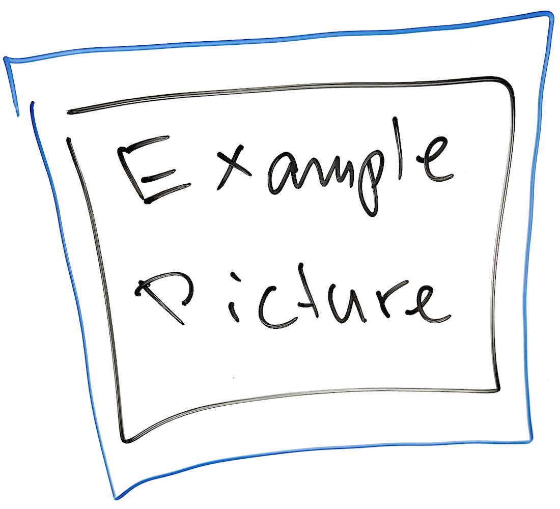
You can include a picture by referring to its filename path. The path should be specified relatively to the folder that contains the markdown source code for the given how-to card.
For example, the picture my_picture.png is saved in folder img/, which is
next to the source of this How-to Card (markdown.md) in git. Thus we include
it as follows:
The result looks like this:
Picture file sizes
To avoid wasting resources, always check that your pictures are compressed properly and resized to a correct resolution!
- Check if the dimensions of the picture are not excessive. Generally, 500×500 pixels is sufficient for any illustration or example picture, and 1000×1000 pixels is usually more than enough even for very detailed pictures.
- Always choose the correct image compression format:
- photos should use JPEG compression (file extension
.jpgor.jpeg) - screenshots of text and bitmap diagrams (which do not include photos!)
should use PNG compression (
.png) - diagrams and vector graphics should use SVG vector format (
.svg)
- photos should use JPEG compression (file extension
- Ensure that the file extension corresponds with the picture compression –
for example, changing the file extension of a photo from
.pngto.jpgdoes NOT change the compression and the image file will remain unnecessarily large. - Ideally, size of graphics files should not exceed 100kB. In rare cases, pictures up to 1MB may be acceptable. If you need to include larger pictures, contact the How-to Cards maintainers.
Specific formatting for How-to Cards#
Do not use HTML or other tricks to enforce exact formatting. While this will work in browsers, it is not very portable to other outputs (e.g., to PDF rendering, or just to different color viewing conditions for the website), and too many colors and effects easily get confusing.
Coloring text#
Color assignment is done using markdown class selectors, as shown in the tables below.
For portability and accessibility reasons, it is recommended to avoid specifying colors directly in the How-to Cards. Instead, please try to use some of the semantic coloring identifiers for the colors, as shown below in the first table – it is better to explain why you think the information should be highlighted. For example, “This should be colored to highlight possible danger” is better than saying just “make this red”.
Semantic coloring#
| Markdown | Result |
|---|---|
[correct choice]{.color-correct} |
correct choice |
[wrong choice]{.color-wrong} |
wrong choice |
[useful information]{.color-info} |
useful information |
[primary information]{.color-primary} |
primary information |
[secondary information]{.color-secondary} |
secondary information |
[something deeply non-standard]{.color-weird} |
something deeply non-standard |
[something successful]{.color-success} |
something successful |
[something dangerous]{.color-danger} |
something dangerous |
[alerted text]{.color-alert} |
alerted text |
[warning]{.color-warning} |
warning |
[**very dangerous**]{.color-danger} |
very dangerous (extra highlight with “strong” formatting, works with all colors) |
[Highlighter effect]{.highlight} |
Highlighter effect |
Direct color specification#
If you need to specify the exact color manually, you can use the following formats:
| Markdown | Result |
|---|---|
[green]{.color-green} |
green |
[yellow]{.color-yellow} |
yellow |
[orange]{.color-orange} |
orange |
[red]{.color-red} |
red |
[violet]{.color-violet} |
violet |
[blue]{.color-blue} |
blue |
[cyan]{.color-cyan} |
cyan |
[grey]{.color-grey} |
grey (UK spelling) |
[gray]{.color-gray} |
gray (US spelling) |
Sizing of pictures#
Pictures can be sized by setting maximum width as fractions of the “recommended” paragraph width. The syntax is based on Pandoc class selectors: Adding a class wX-Y sets the width of the picture to fraction X/Y of the recommended text width (unless the picture is smaller in pixel size, at which point its size is retained). For example, you can make a half-width picture (1/2 width) as follows
{.w1-2}The supported sizings include the following: w1-1, w1-2, w1-3, w2-3, w1-4, w3-4, w1-5, w2-5, w3-5, w4-5. For example, you can make a really small picture as follows:
{.w1-5}The same works for heights, with classes labeled as h instead of w. That is useful for visually aligning the pictures next to each other, even if their original widths and heights differ.
{.h1-4}{.h1-4}
As with widths, the supported range of heights include: h1-1, h1-2, h1-3, h2-3, h1-4, h3-4, h1-5, h2-5, h3-5, h4-5. The “units” of widths and heights are the same – height hA-B is giving the exactly the same height to the picture as would be the width of a picture with wA-B for some A and B.
Exact sizing and increasing the size of pictures#
The class selectors as above are setting “maximal” widths and heights of a given picture. If you need to “zoom in” on a picture (preferably a SVG one, to avoid pixelation), you can use the “exact” classes with an added x, such as hx1-1 or wx2-5.
For example, a tiny picture with hx1-2 is going to get upscaled to fill exactly half of the standard paragraph width.
Avoid specifying the exact sizes everywhere – among other, the pictures marked with such classes will not downscale properly on small screens and cell phones, making your card unusable.
In-line pictures#
For small icons that should be in line with text, there is a special class h-line :
It works {.h-line} like this.It works like this.
Alignment of pictures#
If you need to align the pictures vertically, you can do that as follows:
{.align-left}{.align-center}{.align-right}To make the picture sized and aligned properly at the same time, you can specify any number of classes separated by space:
{.w1-5 .align-right}Note: Alt-text labels on images The text in square brackets in the image definition is called an “alternative text”. It is not rendered by default, but it typically shows up to readers in cases when the pictures can not be loaded (for some reason). On slow connections, the text shows up before the picture is loaded. Also, this text is read by text-to-speech tools for users who can not see the rendering. Remember to always include a several-words summary of the picture in that text, in order to increase the accessibility of your How-to Card.
Groups of pictures and alignment blocks#
You can align a group of pictures to the center in order to make them visually more pleasing. This uses the Pandoc syntax for fenced blocks:
::: centered-block
{.w1-5}
{.w1-5}
{.w1-5}
:::
For extremely large pictures or picture groups, it may be useful to put them into a “wide block”. Such block disables the recommended paragraph width limits, and allows the pictures span as far as possible on the page:
::: wide-block
{.w1-4}
{.w1-4}
{.w1-4}
{.w1-4}
{.w1-4}
:::
Admonitions#
Admonitions are small highlighted boxes with information that ideally should not be missed by readers.
The general syntax for admonitions is as follows:
::: info-box
[Useful information]{.box-header}

This box describes some useful information.
:::

::: danger-box
[Some kind of a warning]{.box-header}

This box describes a possible danger that the readers should avoid.
:::
The result is as follows:
Useful information
This box describes some useful information.
Some kind of a warning
This box describes a possible danger that the readers should avoid.
Note that the box header does not need to be present – the block will simply have no header. Also, for color-matching purposes, the boxes can be marked as blue-box and red-box – the rendering is the same.